Monday, 14 March 2016

Moodboard


This moodboard suggests the style we are basing our animation on. 
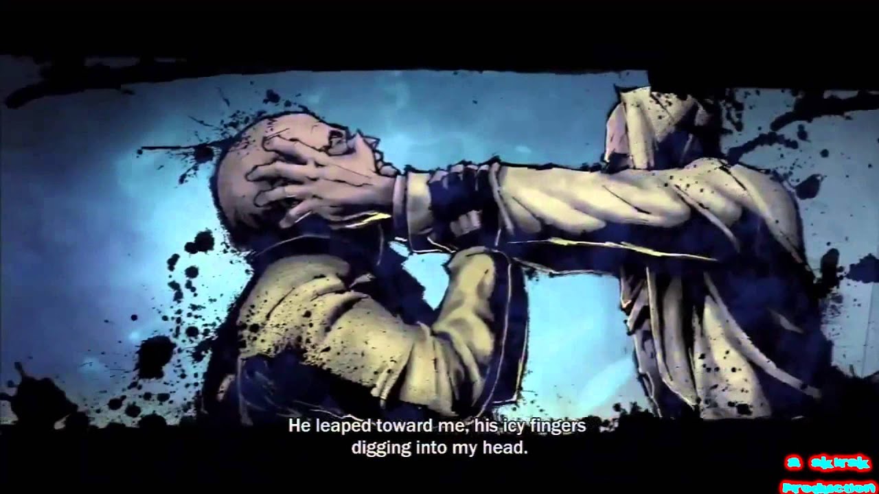
Here there are images of the comic style of Infamous and also The Walking Dead. 

I also included a font style sample. I downloaded this font from dafont.com
The font is called Fighting Spirit and I think the "roughness" of it may be suitable for our animation. Its sharp, edgy and aggressive, therefore something like this would suit our animation.  
This font is found under the comic section, hence it would be suitable for a comic style animation.


Link: http://www.dafont.com/fighting-spirit-tbs.font


Sunday, 13 March 2016

March 13th Sunday

Now that I have written the actual script, the team has begun gathering all of the resources that we need for the animation such as audio. Alex has a clear direction of what the animation is going to look like and the certain aspects or elements that he has to include in each frame to tell the story.

We decided for this past week that we would focus on the presentation foremost. We are all doing our own little parts over this weekend as we found it impossible to meet up due to our opposing schedules. We also had a team meeting on friday so that we knew exactly how the presentation would go and even did a little bit of practice.

Unfortunately, I didn't make the last tutorial with our tutor but luckily I had the script written so my team could easily fill her in on what we were doing.


Sunday, 6 March 2016

Sound Effects Samples

1916 Rising Project Sound Effects 


Here are some sample sound effects that could be use for our project: 
These sounds are from SoundDogs.com and freesound.org


Explosion with echo delay 


Bomb Explosion 


Mauser Riffle 


Possibly a Background noise? 


Different Gun pitches 


The first few seconds of this one before the plane comes in. 


Music : I’m not quite sure what type of audio we should use yet, but here’s a sample. 

Intense Battle Music 


There are a few sound effects to be added to this list, such as crowds shouting etc. However, it is difficult to find good quality sound effects. 
Apart from sound effects, I am also working on finding a voice actor for our voice-over narration. 

Friday, 4 March 2016

Friday March 4th

From our last tutorial with Maria, we have really started to get a sense of what this piece is going to be like. From writing a rough draft of a script, I've realized it is definitely possible to achieve what we want to make the style that we want to make it. We have been meeting up weekly to discuss each element of the animation but the tutorials really help with ironing details out. It is good to communicate all of our ideas together, and foremost, it's very important to keep everyone in the loop of every step of the way.

My main priority is writing a coherent and engaging script. I must write it for the presentation and I have to make sure that it is written in the correct format. Also I have to make sure that that the rest of my team will be able to understand the points that I'm getting.

Also I believe, we have to write a treatment for the presentation as well which is basically to ask yourself, why are you doing this, where will it be disseminated to, and a brief outline or pitch of what the animation is going to be.  

Wednesday, 2 March 2016

In keeping with the 'Infamous' theme, I have been practicing a 'grunge' style effect. Following Sean's storyboard proposal, I have begun doing some concept artwork to gauge how we as a group feel about our current direction. I started with our second scene and will add further pieces in future to aid the design process.
March 2nd


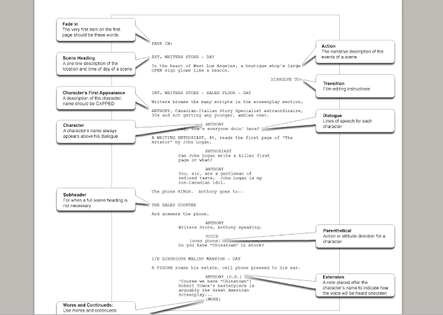
In order for me to start writing the script for the piece, I first wanted to research how to write an engaging and interesting narrative because we don't want to bore people with this animation. Script writing isn't as simple as just writing the story down, I have to capture the scene in it's entirety also I have to give someone who doesn't really understand the story, an idea of exactly the kind of piece that we want. As this is a draft of the script, I won't be adhering to strict script writing rules like format but I will have to explain key details like; camera movement, character dialogue, transitions, scene heading and sub headers. This simple diagram explains the format of a script.


I also wanted to research good script writing practices and I came up with five simple rules for writing an engaging script

1) Establish and maintain a clear voice
This essentially means that when you are writing a character's dialogue, you need to make sure that when you are, you are speaking like that character would speak, you are doing as that character would do, etc.
2) Speak in Vernacular
Characters should speak how they speak in real life, or as close to it as possible, they should speak casually and the dialogue shouldn't feel forced.


3) Give stage directions

When writing scripts, it is important to write down what the character is doing physically, to write down their emotion, stance, etc.


4) Show don't tell

Make the script as simple as possible, let the dialogue narrate the story instead of focusing on describing everything in detail, it's not a novel.


5) Leave them hanging

At the end of each scene, you wanna pull the audience in, create some sort of tension, leave on a cliff hanger, so that the audience wants to actually see the outcome.

Tuesday, 1 March 2016

March 1st 2016

After our last meeting, we have a better understanding of what our animation is going to be. We have figured out the tone of the piece, we have researched narration techniques and possible narrators. We have given examples of the kind of style we want the artistic direction to take. We have an idea of exactly the kind of platforms that we will be releasing our piece.

For this week, we were tasked with each of us finding a particular animation style that we like and to explain why we like that style and to explain why it would work for our piece. I have chosen the animation styles of a videogame called "Infamous".


 This game uses a very stylish approach to how it conveys the cutscenes. As the game is supposed to have a serious, gritty tone, so too does it's cutscenes. It really gives the player an understanding of exactly the kind of game they will be playing. The cutscenes make use of a comic book art style but the style still feels alive and dynamic. In some panels, it's almost like the character are breaking through constraints like the frames of the panel or even proportion. 


This week, I'm going to begin work on a draft of a script, seeing as sean has done a draft story- board, I will be able to work off all the research and what he has so far.